
Holiday Decor Color Trends 2026: A Retail Palette Guide
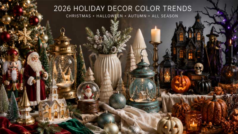 The leading holiday decor color trends for 2026 are moving away from collections built around one dominant seasonal color. Instead, designers and retailers are combining flexible neutral foundations with richer accent shades, metallic finishes and natural textures.Traditional red and green remain important for Christmas, while orange and black continue to provide immediate Halloween recognition. However, these familiar combinations are being updated through deeper tones, softer neutrals, aged finishes and more carefully coordinated materials.
For retailers, importers and private-label brands, color is more than a decorative choice. It influences how products are grouped, photographed, packaged and displayed. A clear palette can connect different product categories and make a seasonal collection easier for customers to understand.
This guide explains how the major color directions of 2026 can be applied to Christmas, Halloween, Harvest and all-season decoration programs for European and North American markets.
Why Color Planning Matters in Seasonal Retail
Customers rarely view seasonal decorations as completely isolated objects. They often shop for products that can work together on a mantel, dining table, porch, Christmas tree or retail display.
When figurines, lanterns, water globes, wreaths and ornaments share a coordinated palette, the complete collection feels more intentional. Retailers can then present several product categories as one decorating story rather than a group of unrelated items.
Color coordination also improves ecommerce presentation. Product photographs look more consistent when backgrounds, packaging and decorative accents follow the same visual direction. This can make category pages easier to browse and strengthen the identity of a private-label collection.
A successful palette does not require every product to use exactly the same colors. Instead, buyers should establish several core shades and allow individual products to use different proportions of those colors.
For a broader overview of the design styles influencing the market, read our Holiday Decor Trends 2026 report for Europe and North America.
Cloud Dancer Brings Soft White Into 2026 Collections
Pantone selected PANTONE 11-4201 Cloud Dancer as its 2026 Color of the Year. Pantone describes it as a versatile white that can provide a foundation for other colors rather than competing with them.
This makes soft white especially useful for seasonal decoration programs. It can act as the main color in a quiet winter collection or provide contrast for burgundy, forest green, blue, gold and darker Halloween tones.
Unlike a sharp, highly reflective white, a softer white can feel warmer and easier to combine with fabrics, wood-look surfaces and aged finishes. It can be used on snowmen, angels, ceramic-look figurines, Christmas trees, ghost characters and illuminated decorations.
For Christmas collections, Cloud Dancer-inspired whites can create a snowy foundation without making the display feel cold. Champagne gold, pale wood and warm LEDs can add comfort, while silver and icy blue can create a more contemporary winter atmosphere.
For Halloween, soft white can be used on friendly ghosts, skulls, candles and vintage-inspired characters. When combined with charcoal, muted orange or antique gold, it creates a softer alternative to strong black-and-white contrast.
Retail buyers should treat this direction as a flexible base rather than a rule that every product must become white. Its commercial value comes from its ability to connect brighter seasonal colors within one collection.
More information about the official color direction is available from Pantone Color of the Year 2026.
Patina Blue Adds an Aged Decorative Character
Etsy selected Patina Blue as its 2026 Color of the Year. The shade is inspired by the blue-green surface that can develop on aged copper, giving it a combination of natural, vintage and metallic associations.
Patina Blue can be useful for seasonal products because it feels more decorative than a basic bright blue. It works especially well with antique gold, aged brass, copper, warm white and natural brown.
In Christmas collections, the color can appear on vintage lanterns, ornaments, winter village rooftops, decorative ribbons and glass-look products. It can also be introduced through smaller painted details rather than covering the complete item.
For Halloween, Patina Blue can support gothic, mystical and haunted-garden themes. It coordinates well with weathered stone, dark foliage, old metal and supernatural lighting effects.
The shade can also help connect seasonal products with year-round home décor. A lantern, candle holder or decorative figurine using an aged blue-green finish may remain suitable for display after the main holiday period.
Buyers should review the finish carefully during sampling. The intended result may depend on several layers of blue, green and metallic color rather than one flat painted surface.
Etsy also identified Washed Linen as its first Texture of the Year, reinforcing the wider movement toward natural variation, softer materials and less polished finishes. The official announcement is available through Etsy’s 2026 color and texture report.
Warm Earth Tones Support Nostalgic Holiday Designs
Warm brown, terracotta, caramel, muted red and natural wood tones are becoming useful foundations for nostalgic seasonal collections.
Christmasworld’s 2026 “brave” direction combines warm earth tones with metallic accents, handcrafted surfaces, fine woods and ceramic textures. It also uses figurative motifs and retro-inspired patterns to connect traditional memories with newer design forms.
This approach is particularly suitable for gingerbread characters, woodland animals, nutcrackers, vintage Santa figures and autumn products. Warm colors can make these familiar themes feel comfortable without relying entirely on bright primary shades.
A gingerbread collection, for example, can combine baked brown, cream, muted red and soft candy accents. A woodland Christmas program can use natural brown, forest green, warm white and small amounts of antique gold.
For Harvest and Thanksgiving products, rust, ochre, olive and deep red can be layered with woven fabrics, wood-look textures and aged ceramic finishes.
These colors also photograph well in warm lifestyle settings. However, retailers should use enough contrast to prevent several brown products from blending together on a category page or store shelf.
The complete Christmasworld direction can be reviewed through Christmasworld Trends 26+.
Deep Red Evolves Beyond Traditional Christmas
Red remains one of the most commercially recognizable Christmas colors, but 2026 collections can use more than one version of the shade.
Bright red works well for family-oriented Santa, candy and gingerbread products. Burgundy, wine red and muted berry tones provide a more decorative alternative for premium figurines, velvet ornaments and vintage-inspired lanterns.
Deeper red shades are easier to combine with antique gold, olive green, natural wood and warm white. They can make traditional characters appear richer without removing their immediate Christmas identity.
Red can also appear in Halloween collections through gothic flowers, candles, stained-glass effects and dark romantic themes. In these products, the shade should normally be balanced with black, charcoal or aged metallic surfaces rather than bright seasonal green.
Buyers can use red as a visual link across several price levels. A large Santa figure, smaller resin characters, ornaments and packaging can all repeat the same burgundy or traditional red accent without appearing identical.
Green Expands From Pine to Olive and Moss
Traditional pine green remains essential for Christmas trees, wreaths and garlands. However, softer and more unusual greens are expanding the number of seasonal styles available to retailers.
Olive green works well with burgundy, natural brown and antique gold. It can create a mature Christmas palette that feels less dependent on bright traditional colors.
Sage and gray-green shades are suitable for neutral, botanical and farmhouse-inspired collections. These colors coordinate with cream, linen textures and warm wood surfaces.
Moss green can support woodland Christmas, Harvest and haunted-garden Halloween products. It is particularly effective when used on stone-look figurines, wreaths, tombstones and overgrown decorative scenes.
Poison green remains useful for more dramatic Halloween products, especially witches, monsters, potion themes and illuminated animatronics. Because the color is visually strong, it is often more effective as a lighting or detail color than as the main surface of every product.
Retail buyers can use several green shades within one program, but the undertones should remain compatible. A yellow-based olive may not coordinate naturally with a bright blue-green unless the contrast is part of the intended design.
Blue Moves From Winter Accent to Seasonal Statement
Blue has long been used in icy Christmas and winter collections, but its role is becoming broader.
Soft powder blue and misty blue can support snow globes, glass decorations, angels and illuminated winter scenes. They create a light atmosphere when combined with white, silver and transparent materials.
Deep navy can provide a more dramatic background for gold stars, moon motifs and celestial Christmas products. It also works well in witch-inspired Halloween themes, where it can replace black as the main dark color.
Patina Blue connects blue with vintage metal and natural aging, while teal and blue-green shades can provide stronger all-season appeal.
Retailers should consider how the chosen blue reacts to lighting. Cool LEDs can strengthen an icy effect, while warm LEDs can make some blue surfaces appear greener or less saturated.
Physical samples should therefore be reviewed with the final light source rather than approving the painted color separately.
Metallic Finishes Become Softer and More Varied
Gold and silver remain important in seasonal décor, but highly reflective finishes are not the only commercial option.
Brushed gold, champagne, antique brass, copper and aged silver can create a more decorative appearance. These finishes are easier to combine with natural textures and deeper colors than bright mirror-like metallics.
Champagne gold works well with warm white, blush, burgundy and natural brown. Antique gold supports gothic Halloween, vintage Christmas and traditional religious decorations. Copper can connect Harvest products with Patina Blue and earthy green tones.
Matte silver and pewter are suitable for icy winter scenes, contemporary Christmas products and haunted stone effects. Mirror silver can still be used for modern geometric collections, but it requires careful surface protection during production and transportation.
Metallic color should be evaluated together with the product material. The same paint may appear different on smooth plastic, textured resin, metal and glass.
Buyers should specify whether the required finish is polished, brushed, distressed, matte or antique. Simply requesting “gold” may result in significant differences between the sample and the intended retail collection.
Christmas Color Palettes for 2026 Retail Collections
A traditional Christmas collection can continue using red, pine green, warm white and gold. To update the palette, retailers can introduce deeper red, layered green and brushed metallic finishes rather than relying only on bright primary colors.
A natural Christmas program can combine Cloud Dancer-inspired white, beige, pale wood, sage and champagne gold. Washed fabrics, natural foliage and warm LEDs can support the softer color story.
A winter collection can use soft white, misty blue, silver and transparent materials. Patina Blue or navy can be added to create more depth and prevent the collection from appearing too pale.
A vintage Christmas palette can combine burgundy, olive, aged gold, natural brown and small areas of cream. This works well with Santa figures, nutcrackers, lanterns and retro-inspired decorative patterns.
The color palette should be carried across different product materials. A burgundy fabric hat, painted resin coat and printed package should appear related even when the exact surface texture changes.
For a deeper look at product styles, lighting and materials, continue to our 2026 Christmas Decor Trends for Retail Buyers.
Halloween Color Palettes for 2026 Retail Collections
Orange and black remain the clearest Halloween combination, but retailers can update the palette through burnt orange, charcoal and amber lighting.
A gothic collection can use black, burgundy, dark purple and antique gold. This palette supports skulls, ravens, candles, Victorian frames and dark floral products.
A mystical Halloween program can combine midnight blue, purple, Patina Blue and iridescent silver. Moon, star, crystal and potion themes work naturally within this color family.
A haunted-garden collection can use moss green, weathered gray, dark brown and aged blue-green. Small amounts of orange or purple lighting can strengthen the Halloween identity.
A family-friendly collection can use cream, pale orange, lavender, pink and mint. Black details should remain visible enough to prevent the products from losing their seasonal recognition.
The retailer does not need to place all of these directions within one display. Each palette should support a separate theme so that the collection remains visually clear.
More Halloween design directions are explained in our Halloween Decor Trends 2026 retail guide.
Harvest and Autumn Colors Become More Layered
Harvest décor is often built around orange, brown and yellow. These colors remain useful, but they can be expanded through olive, burgundy, cream, terracotta and dark green.
A layered palette can make autumn products feel more suitable for home interiors and less dependent on one short seasonal event.
Burnt orange works well with chocolate brown and cream. Terracotta can be combined with olive and aged gold. Burgundy can add depth to pumpkins, leaves and floral products without making the collection look like Christmas.
Natural material effects are especially important in this category. Wood-look surfaces, woven fabrics, linen textures and ceramic finishes can make familiar autumn colors feel more current.
Retailers can also use a neutral product base and introduce seasonal color through removable ribbons, floral details or packaging. This can allow some decorative structures to be adapted for several programs.
Neutral Colors Help Seasonal Products Fit Modern Interiors
Neutral seasonal products are not intended to remove all festive character. Their purpose is to make seasonal symbols easier to coordinate with existing home décor.
Soft white, cream, beige, stone gray and natural brown can provide a calm foundation. Stronger holiday colors can then appear through smaller details, lighting or accessories.
A neutral snowman can use a burgundy scarf rather than a fully multicolored outfit. A ghost figure can use soft white with a small black face and amber light. A Christmas tree can combine cream ornaments with warm gold accents.
This approach can be particularly effective for boutiques and home décor retailers whose customers prefer subtle seasonal changes rather than complete room transformations.
Neutral products also provide useful background pieces for more colorful hero items. They can make a retail display feel layered without creating excessive visual competition.
Lighting Changes How Seasonal Colors Appear
The same painted color can look different when illuminated with warm, cool or colored LEDs.
Warm light can make red, brown, orange and gold appear richer. It can also reduce the coolness of white and blue surfaces. Cool lighting strengthens silver, transparent materials and icy winter colors.
Colored LEDs can completely change the appearance of a translucent product. Purple light may create a gothic effect, while green light can make the same structure feel more supernatural or poisonous.
For water globes and glitter lanterns, the light interacts with liquid, particles and the internal scene. Buyers should therefore review the complete illuminated product instead of approving the shell color alone.
When several products are displayed together, different lighting temperatures can make the collection look inconsistent. Using related LED tones helps maintain a coordinated visual story.
Detailed guidance about lighting, sound, rotation and sensors is available in our Interactive Holiday Decorations Wholesale Guide.
Texture Makes Color More Commercially Distinctive
Color does not appear independently from the surface beneath it. A smooth painted product, woven fabric and distressed resin can use the same shade while creating very different impressions.
Washed linen and other softly varied textiles can make cream, beige and muted colors feel more relaxed. Wood grain supports earthy Christmas and Harvest palettes. Carved resin can give dark gothic colors more depth.
Frosted glass softens white, blue and silver, while transparent acrylic allows lighting to become part of the color experience. Distressed metal can combine several tones within one aged surface.
For buyers, this means the color standard should include the required finish. A flat burgundy paint is not equivalent to burgundy velvet, translucent burgundy glass or an aged burgundy wash over carved resin.
Close-up product images should show these surface differences clearly. Texture often provides the detail that separates one seasonal product from similar designs at a lower price point.
Use Color to Connect Multiple Product Categories
A seasonal color story becomes more valuable when it can be used across several product categories.
A Patina Blue Christmas theme might appear on glass ornaments, lantern details, winter village roofs and packaging. A burgundy-and-gold program can connect Santa figurines, water globes, candle holders and wreath accessories.
The colors do not need to cover every product equally. One item may use burgundy as its main surface, while another repeats it only through a ribbon or painted detail.
This controlled repetition creates enough variety to keep the range interesting while maintaining a recognizable collection identity.
Buyers should provide suppliers with physical color references or approved color standards whenever possible. Screen images can vary according to the device, lighting and file format.
The approved sample should then serve as the reference for bulk production. Production checks should review color consistency across different materials as well as between individual units.
Adapt Color Palettes for European and North American Markets
European and North American customers can respond to the same overall trend while preferring different product formats and color intensity.
North American seasonal collections often have more space for bold outdoor products, illuminated figures and strong visual contrast. Traditional red, green, orange and black can remain highly effective when used on large porch and yard decorations.
European programs may place more emphasis on compact interior products, coordinated home décor colors and refined surface finishes. Soft white, natural green, burgundy, Patina Blue and aged metallics can support this approach.
These differences should not be treated as fixed rules. Retail format, target customer and price level remain more important than geography alone.
A single product concept can be adapted through color. A bright red-and-green Santa may suit a traditional mass-market program, while the same structure in burgundy, cream and antique gold can serve a more decorative collection.
Buyers can review the wider sourcing implications in our Seasonal Decor Buying Guide for Retailers and Importers.
How Retail Buyers Should Build a Color Strategy
The color strategy should begin with the intended customer and retail environment. Buyers should decide whether the collection is traditional, contemporary, natural, gothic, playful or premium before selecting individual shades.
A limited group of core colors should provide the foundation. Accent colors can then be introduced to create variety, highlight character details and separate product levels.
Traditional colors should not be removed only because a new annual shade has been announced. Trend colors are most useful when they refresh familiar categories rather than make the complete collection difficult for customers to recognize.
The palette should also be tested across real materials. Paint, fabric, plastic, resin and printed packaging will not reproduce a color in exactly the same way.
Lighting, product photography and display backgrounds must also be considered. A pale product can disappear against a white ecommerce background, while a dark product may lose detail in a poorly lit lifestyle scene.
Finally, the color story should remain flexible enough to support future extensions. A strong base palette can be reused across new characters, sizes and product functions without making the collection feel identical every year.
Frequently Asked Questions About Holiday Decor Colors
What are the main holiday decor color trends for 2026?
Important directions include soft white foundations, Patina Blue, warm earth tones, deeper red, olive and moss green, misty blue, aged metallics and layered neutral palettes.
What is the Pantone Color of the Year for 2026?
Pantone selected PANTONE 11-4201 Cloud Dancer, a soft white described as a versatile structural color that allows other shades to stand out.
What is Etsy’s 2026 Color of the Year?
Etsy selected Patina Blue, a blue-green shade inspired by the aged surface of copper. Etsy also named Washed Linen as its first Texture of the Year.
Are traditional Christmas colors still suitable for 2026?
Yes. Red, green, gold and white remain commercially important. Retailers can update them through deeper tones, softer whites, brushed metallics and natural textures.
What colors are suitable for modern Halloween decorations?
Modern Halloween collections can use gothic burgundy, midnight blue, moss green, aged silver, Patina Blue, pastel lavender and cream in addition to traditional orange and black.
Can seasonal decoration colors be customized?
Yes. Colors, finishes, materials, lighting effects and packaging can be customized according to the retailer’s collection theme and target market.
Develop a Coordinated Seasonal Decoration Collection
A strong seasonal color strategy combines recognizable holiday shades with updated finishes, materials and accent colors. The result should feel new without losing the visual signals customers associate with Christmas, Halloween and autumn decorating.
SYL Crafts supports retailers, importers, distributors and private-label brands with color development, material selection, product design, packaging customization and bulk seasonal decoration manufacturing.
Explore our wholesale seasonal decoration collection or contact SYL Crafts to discuss your next Christmas, Halloween, Harvest or all-season product program.